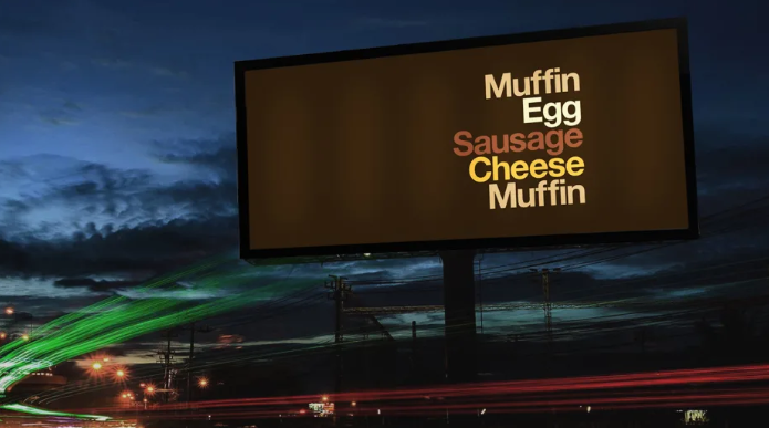
McDonald's may be home of the Big Mac, but its branding just went minimalist.
是麦当劳推出了巨无霸汉堡,然而,如今该品牌却走向了极简主义。
The ad agency Leo Burnett London worked with American designer David Schwen to create a new outdoor branding campaign for McDonald's called "Iconic Stacks."
广告公司李奥贝纳伦敦分公司与美国设计师大卫·施文合作为麦当劳设计了一个新的户外品牌推广活动,该活动被称为“Iconic Stacks”(标志堆叠)。
Dollar menu aficionados will recognize McDonald's classics like the Sausage McMuffin, Big Mac, and Filet-O-Fish by a list of ingredients in McDonald's brand colors and what appears to be the typeface Helvetica on each sign. But there aren't any other hints as to the brand behind the ad.
“一美元菜单”的狂热爱好者们将通过麦当劳品牌颜色的配料表和每个标志上类似Helvetica(赫维提卡,一种字体名称)的字体来辨别出麦当劳的经典菜品,如香肠松饼、巨无霸汉堡和麦香鱼汉堡。但目前并没有关于该品牌广告背后故事的其他线索。
This is just the latest example of McDonald's embracing a minimalist aesthetic. In 2016, the company unveiled new, spartan packaging to replace the busy bags and wrappers it used for years.
这只是麦当劳奉行极简主义美学的最新例证。2016年麦当劳推出了新款斯巴达式包装,以替代多年来一直使用的繁复的袋子和包装纸。

It's also part of a larger trend of "no-brand" branding—pared-down visuals that rely on brand equity, the consumer's established relationship with the company, and knowledge of its products as identifiers rather than overdesigned labels and slick slogans to get the message across.
这也是“无品牌化”大趋势的一部分,即减少用过度设计的标签和华而不实的标语来传递信息,而是依靠品牌价值、消费者与公司建立起来的关系、以及消费者对其产品的认知来使信息可视化。
Startups Brandless and M/F People both launched in 2017 with products that had so much white negative space, they were almost blank slates.
2017年初创公司Brandless(美国平价居家用品和食品电商)和M/F People(一个极简生活方式品牌)都推出了有大量留白的产品,几乎就是空白的状态。
The stacking type conceit may be familiar to people who know Schwen's work. In the design community, he's well-known for making "type sandwiches" that describe what a sandwich is made of by stacking a list of their ingredients on top of each other.
了解施文作品的人可能对这种堆叠式的设计很熟悉。在设计界,他以设计“三明治品种”而闻名,他的作品描绘了如何把材料一层一层堆叠在一起做成三明治。


