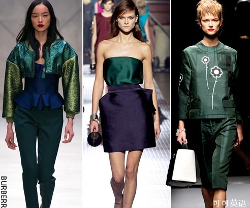
Move over, emerald. The color watchers at Pantone say the 'It' color of 2014 is a pinky purple known as 'radiant orchid.'
翡翠绿,请让开。彩通(Pantone)的色彩观察员称,2014年的“流行”色彩将是一种名为“璀璨兰花紫”(radiant orchid)的粉紫色。
Expect to see the peppy shade on everything from cardigans to coffee makers next year. Vibrant and inviting, it has enough warm tones to look good on most skin types, which makes it a natural for nail polish and lipstick. Pantone executives say that because it is nuanced and bold, the color suggests creativity and ingenuity, which may appeal to fashion-minded, tech-savvy customers in their 20s and 30s. The hue also offers a sharp contrast with emerald, Pantone's color of 2013.
拭目以待吧,明年这种明亮活泼的色调会出现在从羊毛开衫到咖啡机的各类物品上。它活力四射、吸人眼球,它的色调也足够温暖,适合大多数皮肤类型,所以它天生适合用于指甲油和唇彩。彩通的高管称,这种色彩细腻又奔放,会让人想起创造力与独创性,可能会吸引年龄在20多岁和30多岁的注重时尚、精通科技的客户。该色彩还与彩通提出的2013年度流行色彩翡翠绿形成鲜明对比。
At a time when anything goes in fashion, Pantone's heavily marketed 'Color of the Year' announcement can raise eyebrows. These days, there is no 'It' hem length or cut or wash of jeans. So is there still any such thing as the color?
在一个什么事情都融入时尚的时代,彩通大力推广的“年度色彩”一说可能会引发质疑。现如今,褶边长度、裁剪或牛仔水洗方式都没有主打一说,那么还会有像主打色彩这样的事物吗?
'Absolutely, there's an 'It' color for spring, ' says Ken Downing, fashion director for Neiman Marcus, firmly. 'It's pink.'
精品百货店内曼·马库斯(Neiman Marcus)的时装总监肯·唐宁(Ken Downing)说:“当然有,春季就有‘主打’色彩,它就是粉色。”
Mr. Downing hasn't been working with Pantone on its color-of-the-year selection. But violet and purple clothes and accessories have been moving briskly at Neiman Marcus, making these shades the stores' top sellers, Mr. Downing says. As resort and spring fashion collections trickle in, hues are getting pinker. 'Women who follow fashion want to be wearing the color of the moment, ' he says. 'Truly, pink is the color.'
唐宁并未与彩通合作挑选年度色彩。但他表示紫罗兰与紫色的时装和配饰在内曼·马库斯一直卖得很快,使这些色调成为各门店的畅销品。由于度假系列和春季系列开始上市,时装的色彩变得更粉嫩。他说:“紧跟时尚的女性希望穿上流行色彩,确实粉色就是流行色。”
Spring 2014 fashion collections featured a preponderance of pinks and purples on the runways at Prada, Chanel and Dior, all labels that tend to influence other fashion designers. Pantone -- which is in the business of selling color swatches and advice to industries from autos to home decor -- closely watches these runways.
普拉达(Prada)、香奈儿(Chanel)和迪奥(Dior)的2014春季时装系列T台秀展示了大量粉色和紫色时装,而所有这些品牌往往都会影响其他时装设计师。从事销售色卡业务并为从汽车到家装的各行各业提供建议的彩通会密切关注这些T台秀。
Pantone, owned by Washington, D.C.-based Danaher Corp., each year polls graphic, industrial, fashion and other designers around the world, as well as manufacturers and retailers, asking what colors they plan to use in coming seasons. A color committee made up of Pantone executives and clients makes a pick based on the surveys, sales of color swatches and its experts' opinions.
彩通是总部位于华盛顿的丹纳赫公司(Danaher Corp.)的子公司,每一年它都会调查世界各地的平面设计师、工业设计师、时装设计师及其他设计师以及制造商和零售商,询问他们计划在未来几季采用什么色彩。随后,一个由彩通高管和客户组成的色彩委员会会根据调查结果、色卡的销售情况及其专家的意见来进行挑选。
By the time Pantone unveils its color of the year, designs for the year ahead are already in the works. But given the company's insider access -- which amounts to a cheat sheet from style leaders -- its choice tends to show insight. Emerald really did turn out to be a big color last year, and so did the red-orange 'tangerine tango' the year before.
到彩通公布其年度色彩之时,针对未来一年的设计已在准备当中。不过,考虑到该公司可接触到内幕——这相当于来自时尚引领者的备忘单——它的选择往往都是眼光很准的。比如说,事实证明翡翠绿确实是去年的大热色彩,前年名为“探戈橘”的橘红色也是如此。
This year, Pantone felt the best match for the warm hue it was seeing was 'radiant orchid, ' a color appearing in its color guide between 'iris orchid' and 'spring crocus.' Deeper shades of purple have been on the upswing as well; Sherwin-Williams recently announced its 2014 Color of the Year is a murky violet called 'exclusive plum.'
在今年,彩通觉得与它看好的暖色调最相配的是“璀璨兰花紫”,该色彩在其色彩指南上介于“鸢尾蓝”与“春季番红花紫”之间。此外,色调更深的紫色也呈现出上行趋势,美国涂料公司宣伟(Sherwin-Williams)就宣布其年度色彩为被称为“独特紫红”(exclusive plum)的浓郁紫罗兰色。
Housewares, cosmetics and packaging are already showing up in radiant orchid. Keurig, the Burlington, Vt.-based coffee-machine maker, is using the color on its $99 'mini plus' single-serving machine--its smallest--which is coming out in early February.
家居用品、化妆品与包装产品已经开始以璀璨兰花紫示人。佛蒙特州伯灵顿(Burlington)的咖啡机制造商Keurig在即将于2月初上市的99美元“超迷你”咖啡机上采用了该色彩。这款咖啡机是该公司体型最小的产品,每次可以制作一杯咖啡。
Before committing to the colorful machines, Keurig tried out prototypes on consumers and buyers from major retailers. Testers asked people how they felt about the color on a beverage-brewing machine -- and if they could live with it for three years or more, a viable time frame for kitchen appliances, says David Sachs, Keurig's senior vice president of hot beverage systems.
在投入生产这些色彩缤纷的咖啡机之前,Keurig先测试了大型零售商的顾客与买家对样品的反应。该公司负责热饮系统的高级副总裁戴维·萨克斯(David Sachs)称,测试人员会询问他们对冲煮饮料的机器采用这种色彩有何感受——以及他们是否能使用它三年或更长时间,这也是比较切合实际的厨房电器的使用期限。
The color leans feminine, and it may find more fans with two X chromosomes. Urban Outfitters used the color in a bedspread, and Anna Weatherley dinnerware comes in the shade as well. It's a daring color for men. Bold men might try it in a shirt -- solid or print -- while more timid types might just use it as an accent color in neckties and socks.
璀璨兰花紫偏女性化,因此它或许会更受到女性的青睐。Urban Outfitters在一款床单中采用了该色彩,Anna Weatherley的餐具也采用了这一色调。对于男性而言,它是一种大胆的色彩。敢于冒险的人或许会尝试这一色调的T恤——纯色或印花图案的——而较为胆怯的人可能只会在领带和袜子上用到这种色调。
Still, Keurig expects the color to sell well among men and women in their 20s and 30s, because they tend to be open-minded about style issues, from pedicures to pink percolators. It will also appeal to people interested in fashion and interior decoration, says Mr. Sachs. These happen to be the consumers to whom Keurig markets. 'We have very high hopes for radiant orchid based on what consumers have told us, ' he notes.
尽管如此,Keurig还是期望该色彩的咖啡机能在20多岁和30多岁的男性与女性顾客中热卖,因为此类人群往往对从脚趾甲油到粉色过滤壶的各类时尚问题都比较开明。萨克斯说,它还会吸引对时尚和室内装饰感兴趣的人。这些顾客恰好是Keurig营销的目标对象。他指出:“根据顾客提供给我们的反馈,我们对璀璨兰花紫抱有很高期望。”
French cosmetics giant Sephora considered using radiant orchid as a hair color, but backed off, deciding instead to focus on lips, cheeks, nails and eyes. Margarita Arriagata, Sephora's chief merchant, says the color speaks to a romantic trend that's currently on the upswing. 'It's a perfect nail color, ' she notes. 'And we tried the lipstick on every single skin tone. It's killer.'
法国化妆品巨头丝芙兰(Sephora)曾考虑采用璀璨兰花紫用作一款染发剂的颜色,但最终还是放弃,转而决定只将其用于唇彩、腮红、指甲油和眼影产品。该公司首席商务长玛加丽塔·阿里亚加塔(Margarita Arriagata)称,该色彩与当前逐渐高涨的浪漫潮流相吻合。她说:“它是完美的甲油色彩。而且我们在每一种肤色上都尝试了该色彩的唇膏,它简直无所不配。”
Come next June and July, Old Navy will be shipping radiant orchid tops and dresses into its stores. The color hit a fashion sweet spot, appearing in high-fashion collections while not being so challenging that it would appeal only to fashionistas. 'With our customers, we're always looking for broadly appealing trends, ' says Jill Stanton, Old Navy's executive vice president of product and design.
Old Navy将于明年6月和7月将璀璨兰花紫的上衣与裙装运往各大门店。该色彩击中了时尚甜蜜点,出现在一众高级时装系列中,而且不会因为太具挑战而只吸引时尚达人。Old Navy负责产品与设计的执行副总裁吉尔·斯坦顿(Jill Stanton)说:“连同我们的顾客一起,我们总是在寻找具有广泛吸引力的潮流。”
Pantone often chooses stop-you-in-your-tracks colors with hues of red or blue. Hot colors are eye-catching, which is what marketers are looking for; one might walk past a beige bathroom rug without a thought, but a radiant orchid rug will turn your head. But Pantone varies its color choices from year to year, because it wants them to feel fresh. Radiant orchid is at the opposite side of the color wheel from last year's emerald.
彩通常常选择红色调或蓝色调中引人驻足的色彩。暖色调能吸人眼球,这正是营销人员所期望的。人们也许会不假思索地从一张米黄色的浴室地毯旁走过,而一张璀璨兰花紫的地毯会让人回眸。彩通每年都会选择不同的色彩,因为它想让它们具有新鲜感。璀璨兰花紫与去年的翡翠绿在色轮中处于相反的位置。
'In the marketplace, this is a good thing, ' says Leatrice Eiseman, a color consultant to brands and to Pantone, where she heads up the annual search for the Color of the Year. Emerald and radiant orchid actually look good together, Ms. Eiseman argues, but the one is such an about-face from the other that it's likely to encourage consumers to get out and shop in order to stay up to date.
多家品牌的色彩顾问莱亚特丽斯·艾斯曼(Leatrice Eiseman)说:“对于市场来说这是一件好事。”艾斯曼同时也是彩通的色彩顾问,并主持该公司一年一度的年度色彩搜寻工作。她认为翡翠绿与璀璨兰花紫搭配在一起其实很好看,但后者与前者截然不同,所以它可能会促使消费者出门购置该色彩的行头以便跟上潮流。
Ms. Eiseman hastens to note that odd color pairings are popular today. She declares this a new era in color, where people's clothes and even kitchen appliances are no longer matchy-matchy, and radiant orchid can share space on the counter with 2010's turquoise and other shades.
艾斯曼赶忙又指出,现如今奇特的色彩搭配非常流行。她说现在是一个新的色彩时代,人们的衣着甚至是厨房电器都不再是搭配一致的,璀璨兰花紫可与2010年的绿松石色及其他色调一同出现在台面上。


