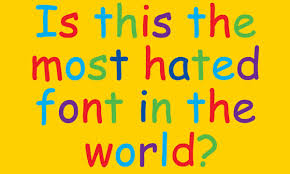
It's 1995.
现在是1995年。
Your word processor is open and before you press a single key, you make the most important decision of your life.
你的文字处理程序是开着的,在你按下一个键之前,你就做出了生命中最重要的决定。
What font do I use?
用什么字体?
All the usual fonts are too conventional.
我所有常用的字体都太传统了。
There were very, few very casual typefaces that you could use.
很少有非常随意的字体可以用。
You keeps scrolling.
你一直在滚动浏览字体。
Too stately,
太庄重,
too boring.
太无聊。
But then...
但后来
It pops out at the menu.
它突然出现在菜单上。
What is this font?
这是什么字体?
It was so different than everything else.
这和其他的所有字体都不一样。
The way it flows is strange.
字体的书写方式很奇怪。
It had irregularity about it.
这种字体有点脱离常规。
And uniquely flawed.
而且有独特的缺陷。
The stems aren't perfectly straight, it were quite wobbly.
字干不是完全直的,有点歪歪扭扭。
This is the font you want.
这是你想要的字体。
And in that moment, you and millions of other people click on the button that says Comic Sans.
在那一刻,你和其他数百万人点击一个按钮,上面写着“Comic Sans”。
How did a font, both loathed and cherished, come to dominate the world?
一种让人又爱又恨的字体是如何主宰世界的?

My name is Vincent Connare.
我叫文森特·康纳雷。
I was a typographic engineer at Microsoft.
我是微软的版式工程师。
I contributed to lots of fonts like Web Things, Trebuchet and most notably, Comic Sans.
我参与设计了多种字体,比如Web Things,Trebuchet,最引人注目的是Comic Sans。
So it's all my fault.
都怪我。
To understand Comic Sans, you have to understand its creator.
要想理解Comic Sans字体,你必须了解它的创造者。
Years before his work at Microsoft, Vincent was working on his undergrad in New York city.
在微软工作的前几年,文森特在纽约读大学。
We went to university in the 1980s.
我们上大学是在20世纪80年代。
I was a quite young, rebellious, fine arts student.
我是一个相当年轻,叛逆,又优秀的美术生。
He'd spend a lot of time in art spaces.
他会花很多时间在艺术空间里。
And I'd walk through the galleries of the old Soho and look at paintings and artwork.
我会穿过旧苏豪区的画廊,看看绘画和艺术品。
To him, what separated good art from bad art was this simple benchmark.
对他来说,把好的艺术和坏的艺术区分开来的是这个简单的基准——与众不同。
If you didn't notice them, I considered that was bad.
如果你没有注意到这些基准,我认为那很糟糕。
And if you did notice, it was good, because at least they made you stop and look.
如果你注意到了,那就好了,因为它们至少让你停下来看看。
It either shocked you or you really liked it,
它要么让你震惊,要么你真的喜欢它,
but if he didn't even notice and you just walked through, it was a disaster.
但如果根本没有注意到,而只是走过,那就是一场灾难。
Vincent would take that philosophy to Microsoft,
文森特将这一理念带到了微软公司,
where he was challenged to make a playful font for a program called Microsoft Bob.
在那里他被要求为一个名为Microsoft Bob的程序制作一个有趣的字体。
And so I looked at Batman and the Watchmen
所以我看着蝙蝠侠和守望者,
and pretty much tried to draw on the computer, something that looks similar to that, but not copying it.
试着在电脑上画出类似的东西,但不是复制。
So that's how Comic Sans was made, by just looking at comic books and comic characters.
这就是漫画书和漫画人物的制作方法,只是看着漫画书和漫画人物。
Not everyone was a fan of the font's quirks.
不是每个人都喜欢怪异字体。
My boss, Robert Norton, And he didn't really like the font and he thought it should be a bit more typographic.
我的老板罗伯特·诺顿就不太喜欢这个字体,他觉得应该更排版一点。
And I argued and said, "No, it should be weird."
我据理力争,“不,它应该很奇怪。”
And I thought it stood out and it wasn't boring typography that's in a school book,
我觉得它很突出,而且不同于教科书上的枯燥的字体,
Though the font didn't make it to the release of Microsoft Bob, it was eventually pre-installed on every Macintosh by 1996.
虽然微软Bob发行时没有使用这种字体,但到1996年,它最终被预装在每台麦金塔电脑上。
I started to see it when it was in the wild, so to speak.
可以说,我是在自然环境中开始看到它的。
The first one I remember was a neon sign over a store called Fun Stamps.
我记得,我第一次是从一家名叫趣味邮票的商店的霓虹灯招牌上看到的。
That's when I realized it's going to get used anyway anybody wants to use it.
就在那时,我意识到任何喜欢这种形式的字体的人都一定会使用它的。
And that just snowballed from there.
从那时起,使用这个字体的人越来越多。
The font spread like wildfire in ways Vincent didn't even imagine.
“Comic Sans”字体像野火一样蔓延开来,文森特甚至没有想到。
When I traveled the world and see it on beach towels.
我环游世界的时候,在沙滩巾上看到了“Comic Sans”字体。
War memorials.
还有战争纪念馆。
On bread.
面包。
Street signs.
路标。
On everything.
所有东西上。
Its overexposure even spurred a group of designers to start an anti Comic Sans movement.
它的过度曝光甚至刺激了一批设计师发起了一场反Comic Sans运动。
I thought it was funny.
我觉得很有趣。
I didn't really find it offensive.
我并不觉得受到冒犯
After all these years, Vincent finds himself content with how history will remember him.
这么多年过去了,文森特发现自己对历史记住自己的方式感到满足。
And Comics Sans is not one of the better pieces of art, but conceptually it's one of the best things I've ever done.
Comics Sans并不是一个更好的艺术作品,但从概念上讲,它是我创造的最好的东西之一。
It probably is the best thing I have ever done.
这可能是我创造的最好的东西。


