If you're in a theater during previews and you see this, you know, to expect a comedy movie.
看点映的电影的时候如果你看到的是这种字体,你就知道它是一部喜剧。
If you see this — you know it’s going to be action.
如果你看到的是这种- 你就知道是动作片。
Make the letters a little skinny — and boom. It’s sci-fi.
因为他们的字体比较窄 - 嘭!科幻片。
You know this one's going to have fast cars.
这种字体的片子里一般会有飙车的镜头。
This one’s going to have Michael Cera… and this one’s gonna be a rom-com.
而这种字体的电影里会有迈克尔·塞拉.......这种则是浪漫喜剧。
You don’t even need the music to know it.
大家甚至不需要听片中的音乐就能断定片子的类型。
But what about this?
那这种呢?
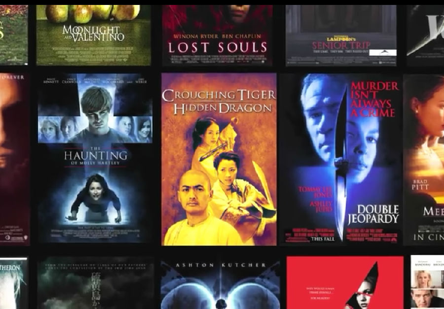
This typeface — Trajan – is probably one of the most popular movie poster fonts ever.
这种字体 - 也即图拉真字体 - 可能是有史以来最受欢迎的电影海报字体之一。
You can see it in Crouching Tiger, Hidden Dragon, Double Jeopardy, Letters from Iwo Jima...
《卧虎藏龙》、《双重危机》、《硫磺岛的来信》……用的都是这种字体。
It’s everywhere.
这种字体可以说是无处不在。
So how did it get there?
那它是怎么火起来的呢?
"I'm Yves Peters, I am a graphic designer who has been writing professionally about type and typography since about 10 years."
“我是Yves Peters,我是一名平面设计师,我差不多是十年前开始专注于类型和排版设计的。”
Yves has looked at a lot of posters. And a few years ago, he started to notice a trend.
伊夫看了很多海报。几年前,他开始注意到一种趋势。
"I started clicking, clicking, clicking, and didn't know where I started because I ended up looking at about 16,000 posters.
“我开始点击,点击,点击,我也不知道我从哪里开始看的,反正最终看了将近1.6万张海报。
Yeah. Well, I look at about 100 posters per month and I've been doing this series since 2006… It’s a lot of posters every year."
是啊。好吧,我一个月要看大约100张海报,并且从06年以来我一直都看在......加起来每年看的量都非常大。”
He noticed that the use of Trajan rose significantly in the last couple of decades. But why?
他注意到,过去几十年来,图拉真字体的使用显著上升。那这是为什么呢?
In 1989, designer Carol Twombly adapted inscriptions from Roman emperor Trajan’s column into a digital typeface.
1989年,设计师Carol Twombly将罗马皇帝图拉立的图拉真圆柱上的铭文改编成了一种数字字体。
It was made for Adobe, so it was a part of the software that a lot of people were starting to use to make posters.
这种字体原本是为Adobe的软件制作的,后来很多人都用这一软件来制作海报。
A couple years later, it made its movie poster debut here — for Héctor Babenco’s At Play in the Fields of the Lord.
几年后,这一字体首次在这张电影海报上亮相了 - 也就是海科特·巴班克导演的那部《在上帝赐予的土地上游玩》。
After that, it was on The Bodyguard, and Scent of a Woman.
此后,它又出现在了《保镖》(1992)和《闻香识女人》(1992)等电影海报上。
Then it was on three 1993 box office hits.
次年又出现在了三部叫座电影的海报上。
By 1994, it was everywhere.
到1994年,这种字体就已经无处不在了。
"It's originally used for epic movies, movies about people that overcome difficulties, like the big war epics and so on.
“它最初是用于史诗电影的海报,也就是关于人类克服困难的电影,比如关于大型战争的史诗片等。

But then you see gradually that it becomes the standard movie font.
但随后你逐渐发现它已经成了标准的电影字体。
It's like the Arial of movie posters.
就像是电影海报字体库的Arial字体一样。
So people need to churn out a poster really quickly, and they just pick Trajan."
所以,需要快速制作一张海报的时候人们就会直接选图拉真字体。”
Eventually, that overuse changed the kinds of movies that used the typeface.
最终,对这种字体的过度使用改变了使用这种字体的电影类型。
"You don’t see it as much on the big productions anymore.
“大制作电影的海报上不怎么能看到这种字体了。
It's become the typeface of horror movies, B-movies, and also the straight-to-video ones.
这种字体成了恐怖片,B级片(低成本商业片)以及直播视频的字体。
So you'll see that a lot of posters are for the lesser movies that want to pretend they are better than they actually are."
所以大家会看到很多海报都是那些实际水平并没有看上去那么好的低成本电影。”
The rise and fall of Trajan illustrates the downside of digital typeface.
图拉真字体的兴衰也暴露了数字字体的缺点。
The convenience of swapping fonts is a huge shift from old movie poster days
如今这种替换字体的便利性从过去的电影海报时代发生了重大的转变,
when hand-painted typefaces or “lettering”was an art that was specific to each movie.
那时,手绘字体或“刻字”还是每部电影特有的艺术。
"So what you see behind me — this is more like the pre-blockbuster thing, pre-genres, pre-standard styles —
“我身后这些海报——它们应该说是图拉真字体大火特火之前,成为类型,成为标准之前电影海报的字体样式
and that's why you will be hard pressed to find two that are similar."
这就是为什么你很难找到两张字体相似的海报的原因。”
That doesn’t make today’s genre-specific typography bad design.
这并不能说明,今天特定类型的电影使用特定字体的做法就是不好的。
These visual clichés make it possible to communicate tone and plot details to an audience incredibly efficiently.
这些视觉上略显俗套的字体设计能够极为高效地向观众传达电影基调和情节细节方面的信息。
And there’s a certain art to that.
这也是一种艺术。
"People get nostalgic about the old era of movie posters, when everything was still done by hand and still very unique.
“人们会怀念从前的电影海报,因为那个时候什么都是手工制作的,同样也是非常独特的。
But you could compare it to music, where some people say, 'nothing was...nothing good was produced since the Beatles.'
在这方面大家也可以和音乐进行比较,因为在音乐方面也有人说‘自披头士以后再无好音乐。’
But then there are people who say 'there's nothing good since Mozart.'
但也有人说‘自莫扎特以后就没有好音乐了。’
Fair enough, but there's many other interesting things that are being produced now.
说得好,但现在我们也制作了许多有趣的其他东西。
There’s just much more. But there's still a lot of very good poster design happening.
而这些好的东西要比从前的多得多,而且目前还有一大批好的海报正在被设计出来。
It’s just, you need to know where to look."
只是,你需要知道往哪里看。”


