Hi,I'm Martin Lewis and I'm going to be teaching you a class
大家好,我是马丁·路易斯,我将为你们教授一门
Of geography of U.S presidential elections
关于美国总统选举地理学的课程
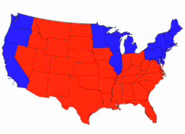
I think we all familiar with this map of red and blue America from the 2004 election
我想我们都很熟悉这幅2004年美国大选的红蓝阵营图
Unfortunately it's a rather misleading map
但这幅地图其实极具误导性
If you map America different way you see very different patterns
如果我们用不同的方式来绘制这幅地图,你会看到非常不同的分布格局
Democrats tend to prefer a map like this
民主党人会比较喜欢这幅地图
That shows states that relative to their population size
图中各州面积与其人口数量有关
We see a rather larger blue America
使得民主党阵营看起来大了很多
Republicans, on the other hand might prefer map that shows county level data
而共和党人则更喜欢大选的县级选情地图

Which shows that even in blue states like California and Pennsylvania
因为如图所示,连加州和宾夕法尼亚这样的蓝色州
most counties actually vote Republican
也有很多县实际上是支持共和党的
Independents in centrals may prefer map like this that shows purple America
独立选民也许会更喜欢这幅地图,地图中的美国是紫色的
Because in most parts of the country the voting pattern is fairly evenly divided
因为在美国的大部分地区,选情的分布其实是非常均匀的
What happens if we throw it all together
如果将这几幅地图合成会怎样
As the Mark Newmeton and his colleagues at the University of Michigan have done
密歇根大学的马克和他的同事们一同制成了这幅地图
Here we see a different America
我们在这幅图中看到一个不一样的美国
Here we see one, where the cities or inner suburb are blue or in the south at least purple
许多城市和内郊支持民主党(蓝色)或者在南部两大阵营支持率相当(紫色)
But they tend to be surrounded by the outer suburb very heavily Republican votings
而包围城市的外围郊区则都是倾向支持共和党(红色)
We see bright red rings
我们看到很多明显的红色环型
and Republicans will note these tend to be the fastest growing counties in the United States
共和党人知道这些红色环形都是如今在美国发展最快的县


